Valentine's Day designs for Pratt Fine Arts Center
2022.02.14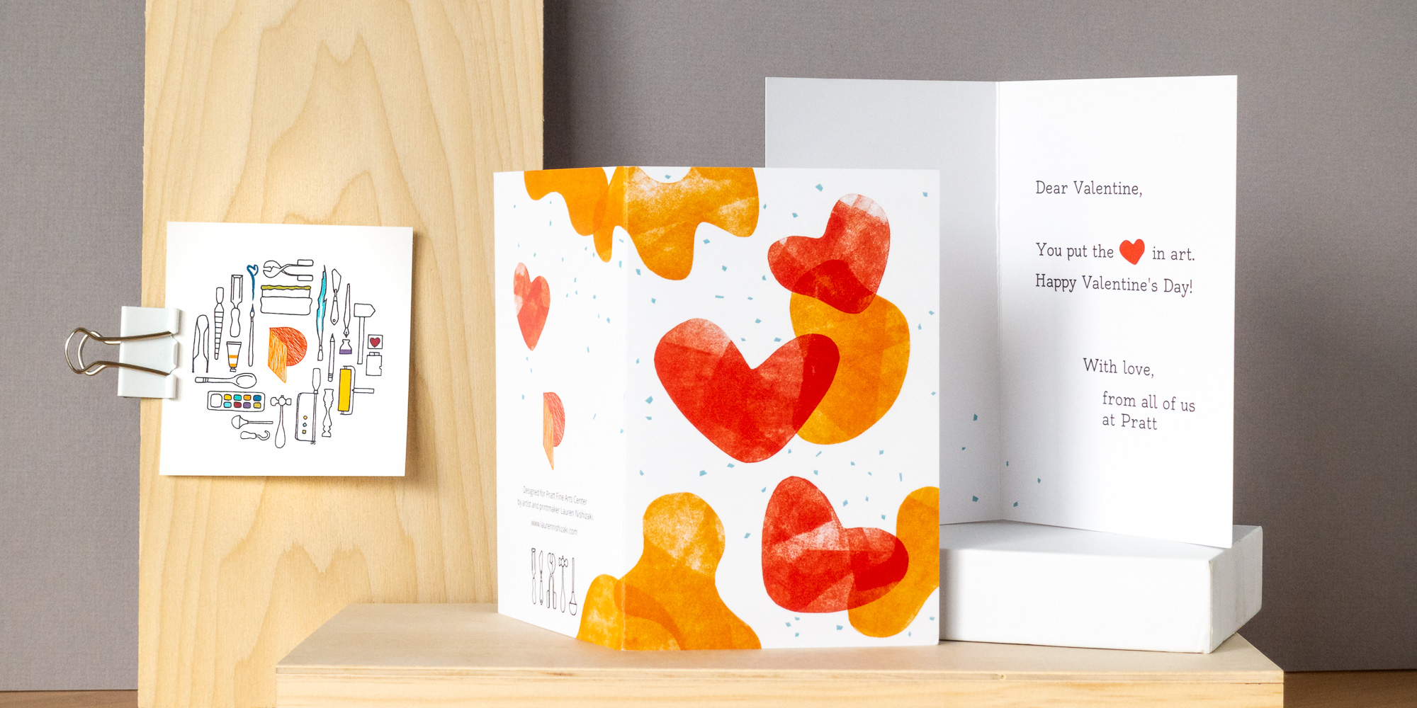
Pratt Fine Arts Center is an arts education center in Seattle, WA that provides classes and studio space for a wide array of art disciplines, including printmaking, woodworking, glasswork, and jewelry and metal smithing. In January 2022, Megan Zembower from Pratt reached out to me about designing a greeting card and sticker combo that could be sent to Pratt donors in celebration of Valentine’s Day. I delivered print-ready files for the card and sticker, as well as digital files for use on Pratt’s social media channels and website.
I had the pleasure of working with Lauren to create Valentine’s Day cards and stickers which were distributed to supporters of Pratt Fine Arts Center. Not only did Lauren offer several lovely design options to suit our needs, but she also designed a fun artistic rendering of our organization’s logo. Lauren was great to work with and went above and beyond to ensure that we had what we needed from this project, maintaining open communication and delivering her work ahead of schedule throughout the whole process. We are thrilled with how the cards and stickers turned out, too!

Design process
When I was first contacted, Megan mentioned that she and her colleague liked the repetitive nature of my ginkgo leaves card and my “Knit Study No. 1” print. I tried to include similar elements in my design proposals.


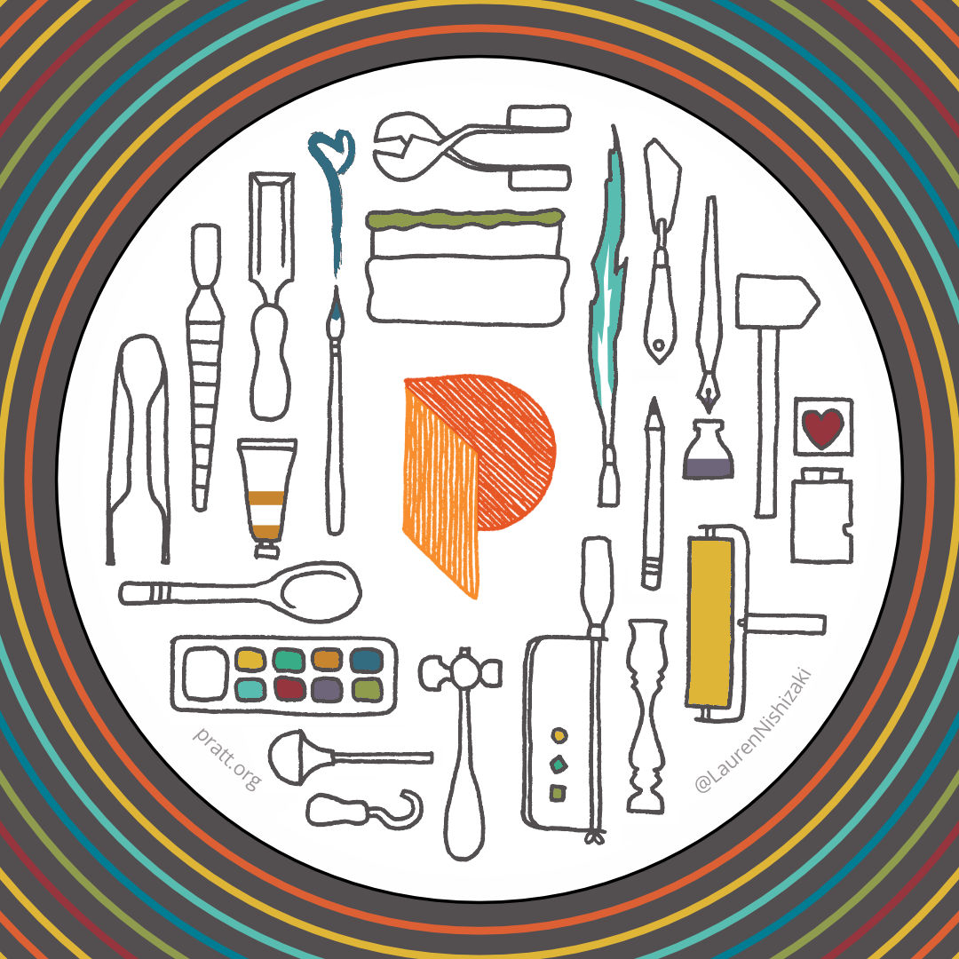
I started by coming up with multiple ideas for the card. I settled on two initial ideas: a flat-lay-inspired array of hand-drawn tools, and an abstract design comprised of hand-printed elements (the hand-printed nature was communicated verbally; my initial sketch consisted of overlapping solid shapes). We decided to proceed with both ideas, using the abstract design for the card and the tools for the sticker. Elements on the back of the card tied the two designs together.
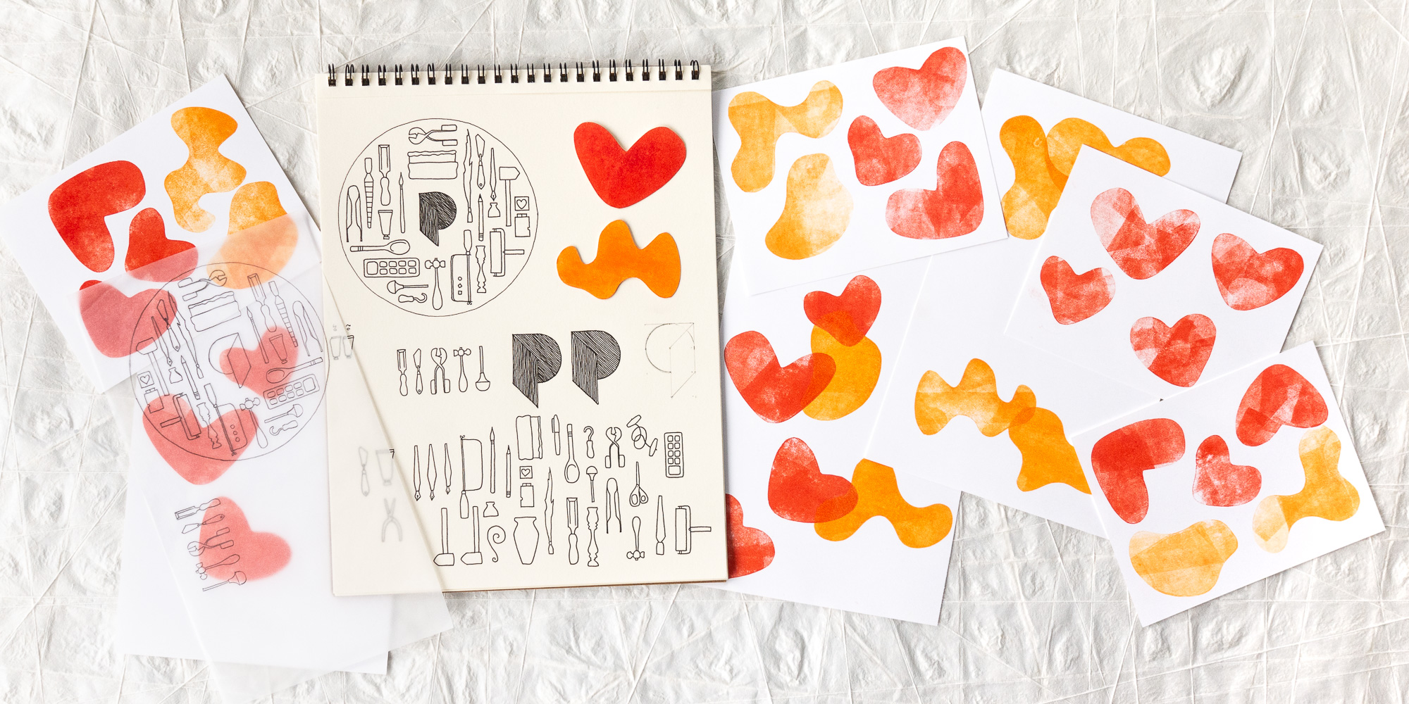
All designs started out as hand-drawn or hand-printed elements. After all the ink dried, I scanned my source images, color-balanced and touched them up in Lightroom and Photoshop, then composed them into the final designs and typeset Pratt’s message using Affinity Designer. I added additional color accents digitally.
I sent the print-ready files to Pratt with plenty of time for them to be printed and put into the mail, ready to arrive by February 14.